Friday 16th April was the big day, as time had come to launch our newly redesigned Bath & Unwind shopping site! Tons of changes, huge upgrades and improvements, both on our side and on the site. I think I can speak for all of us when I say we are wildly proud of this new site, as it both accomplishes the goals we set out to achieve on day one, and in fact far exceeds them in a number of areas. I’ll go over a few of the major changes here, and you can find out more by following us on Twitter, where I will be tweeting new site content every Friday!
Old vs. New: What Changed?

Homepage Overhaul
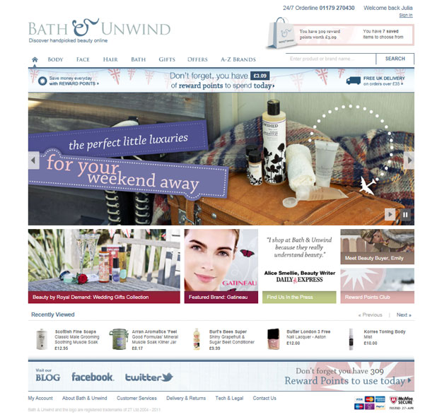
Our most dramatic change comes to our homepage. We redesigned the navigation to have more intuitive drop downs which appear universally on the site, removing much of the navigation redundancy of the previous version. There is also the addition of an easily adaptable image rotator to showcase current collections and promotions (such as our weekend getaway goodies), and a generally cleaned-up and modernized grid-based layout. During the design process, we thought a lot about our identity as a company, and how we wanted that to really shine on the site. Bath & Unwind is a successful e-retailer, and our customers know and love that we have a real personal connection with them at every stage of their experience, which is now reflected at each stage of their interaction within the site.
More Customer Interaction and Sharing Options
There are now more ways for our customers to interact with us as well, such as our Facebook, Twitter and blog links, the recently viewed items widget, saved items and the interactive navigation and customer product reviews areas. Our shoppers can now rate product reviews in order to help other shoppers choose their favorite items. We have also included the popular AddThis sharing tool on each product page, allowing our customers to share the products they love and recommend in any way they are most comfortable with. Lastly, a revamp of the newsletter sign-up process, making it quicker and easier for our customers to sign up for exclusive offers and beauty newsletters.

Searching For What You Want
Really, searching has never been more awesome. You can now search the site in a number of ways. You can type something specific into the search box if you know exactly what you want and you want it now. You can browse the category drop downs for what you are generally looking for, and then refine by a number of attributes depending on the category. For example, dry skin or fine hair, sale items, narrow it down by price, or you can select a specific brand on our interactive
Customer Services and My Account Improvements
If you stop by any of these pages, you will see that we have tried to make these often overlooked areas easy to use, easy to navigate, and as straight forward as possible. Specifically the Delivery & Returns page has been wholly reorganized and revamped, and we have added an About Us: Our Philosophy page and an About Emily area to introduce everyone to the force behind “Emily Loves.”
The FAQ section has been greatly expanded, as well as linked to a number of other areas on the site. One of my favourite new features is the link between our Contact Page form and the FAQ section. When you select the type of query you are submitting, the list of displayed FAQs changes, in hopes that perhaps we can quickly answer your questions before you even ask them. That’s right, a little mind-reading never hurt any website! (note: Bath & Unwind does not condone mind reading or it’s use on customers.)
The basket page has also been reorganised to confront a number of issues including clear display of rewards points, saved items, how to enter a voucher code, and delivery information. Our customers will also notice the addition of a ‘quick view’ basket area in the top-right of each page. Just click on this area, and a dropdown appears, showing you all the items currently in your basket, and allowing you to remove them, see a sub-total, and proceed to the checkout process, without ever leaving the page you are currently viewing!
Photography Shoot
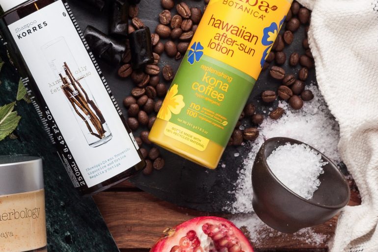
One of the most exciting parts of this design process was our first photography shoot earlier this year, providing us with rich, location and product shots to use throughout the site. This has really set a new standard for how we communicate our passion for beauty to our customers, and (we hope) will be the first of many photo shoots we do to keep our website fresh and interesting.
In Summary
The key to this design was truly keeping our site users and beauty lovers in the forefront of each and every choice we made along the way. When you design for great content with the user in mind, it’s hard to go wrong. The site has only been live a few days, but the feedback we have gotten thus far is overwhelmingly positive, it really was truly a team effort here in the office and we are very proud! Do take a look at the new site here & let us know what you think!


